JOURNALLY
UI/ UX
2021
OBJECTIVE
Journally is a mobile app that functions as a journal, note keeper, and scrapbook, with an emphasis on incorporating pictures and words.
I wanted to address a few issues I saw in many journaling apps:
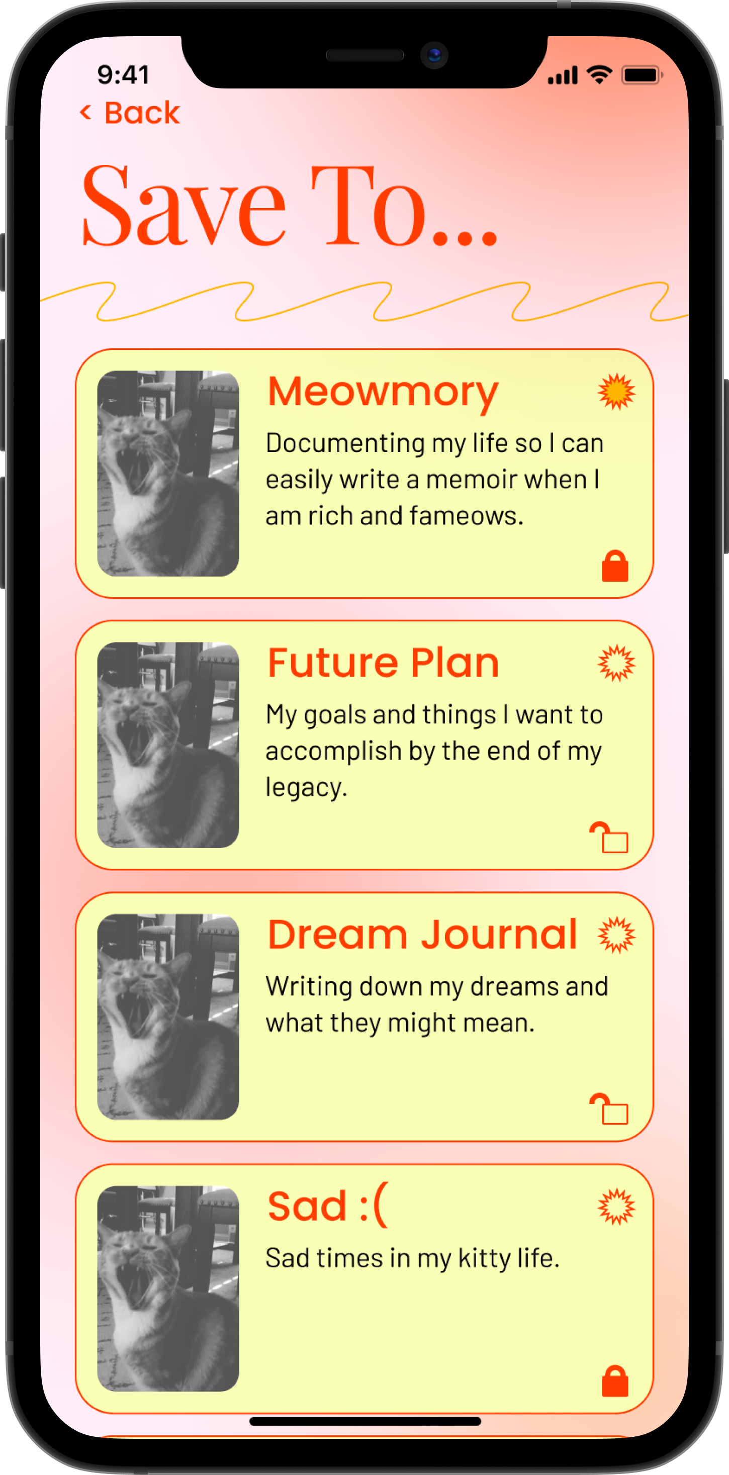
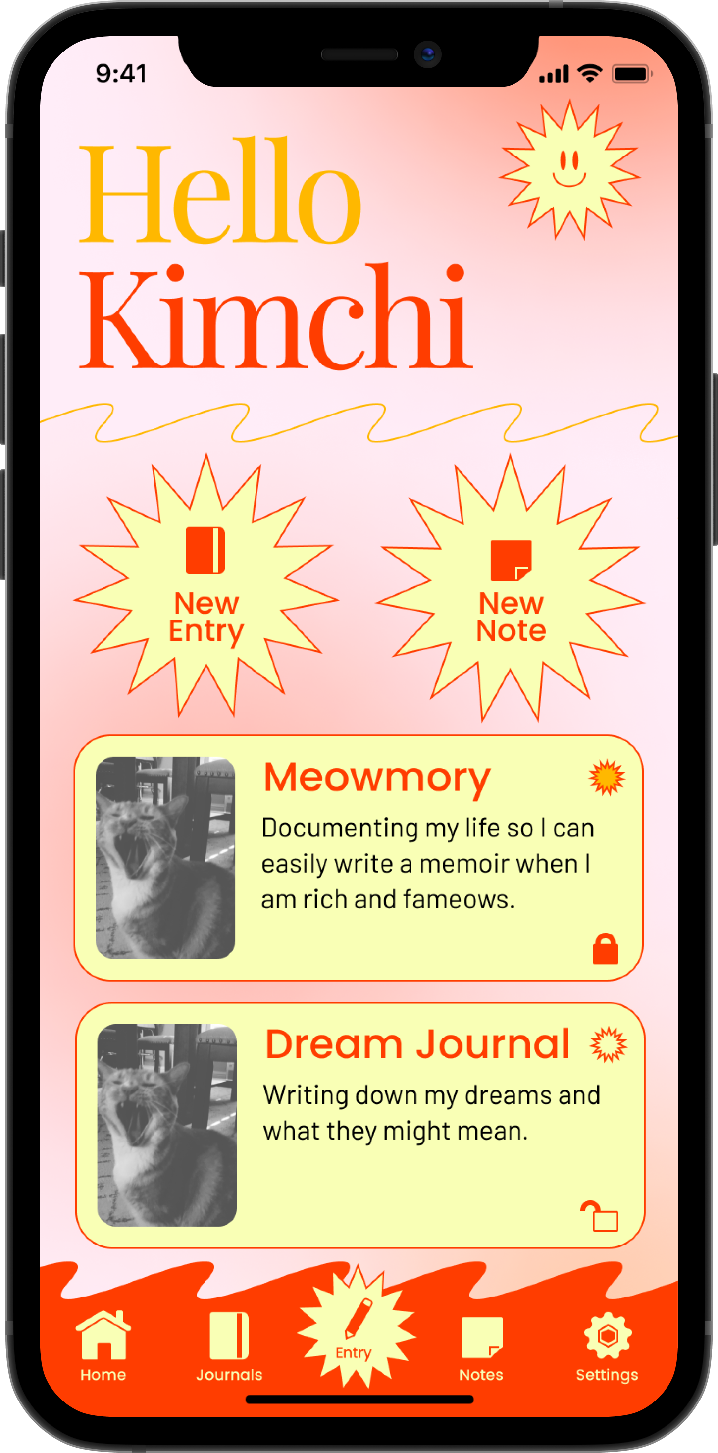
- Unable to incorporate images into journal entries
- No way to organize or create separate journals for other subjects
- Plain and minimal design
PROBLEM STATEMENT
I journal as a way to organize my thoughts during stressful times and to document events in my life. However, I don’t have a centralized space to place my thoughts and pictures, so my efforts are in vain. This upsets me because I end up forgetting important things I want to remember.
RESEARCH
The research for this project included research, interviews, market research, user profiles, and user stories.
I realized pros and cons between the two main ways of journaling: traditional and digital.
I wanted to find a way to find a middle ground between these when creating my app.
I wanted to find a way to find a middle ground between these when creating my app.
INTERVIEWS + USERS
It was important for me to get voices other than my own when it came to journaling. I understood that everyone’s experiecnes are different, and learning what other people want or feel is lacking from the current situation helped me develop my app more.
After conducting interviews with other people who journal, I noticed some common sentiments:
- People want to journal more often, but it is inconveient.
- People journal for different reasons and often keep separate journals for specific topics.
- People journal at different frequencies
- Journaling is very personal, and the medium itself sould reflect that too.
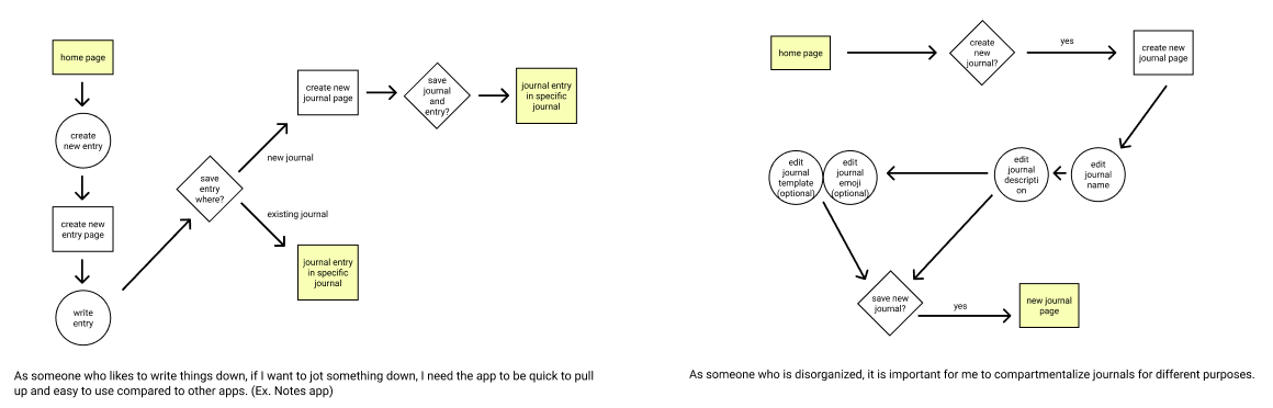
USER FLOWS
DESIGN PILLARS
My previous research helped me create the following design pillars. These pillars were key points I kept in mind while creating my wireframes and final app design.
Convenient
Adaptable

Lively
DESIGN PROCESS
While planning the screens for my app, I thought heavily about how to navigate the app in the most efficient way.
I wanted as few roadblocks as possible when it came to reaching each objective. The less steps, the bettter.
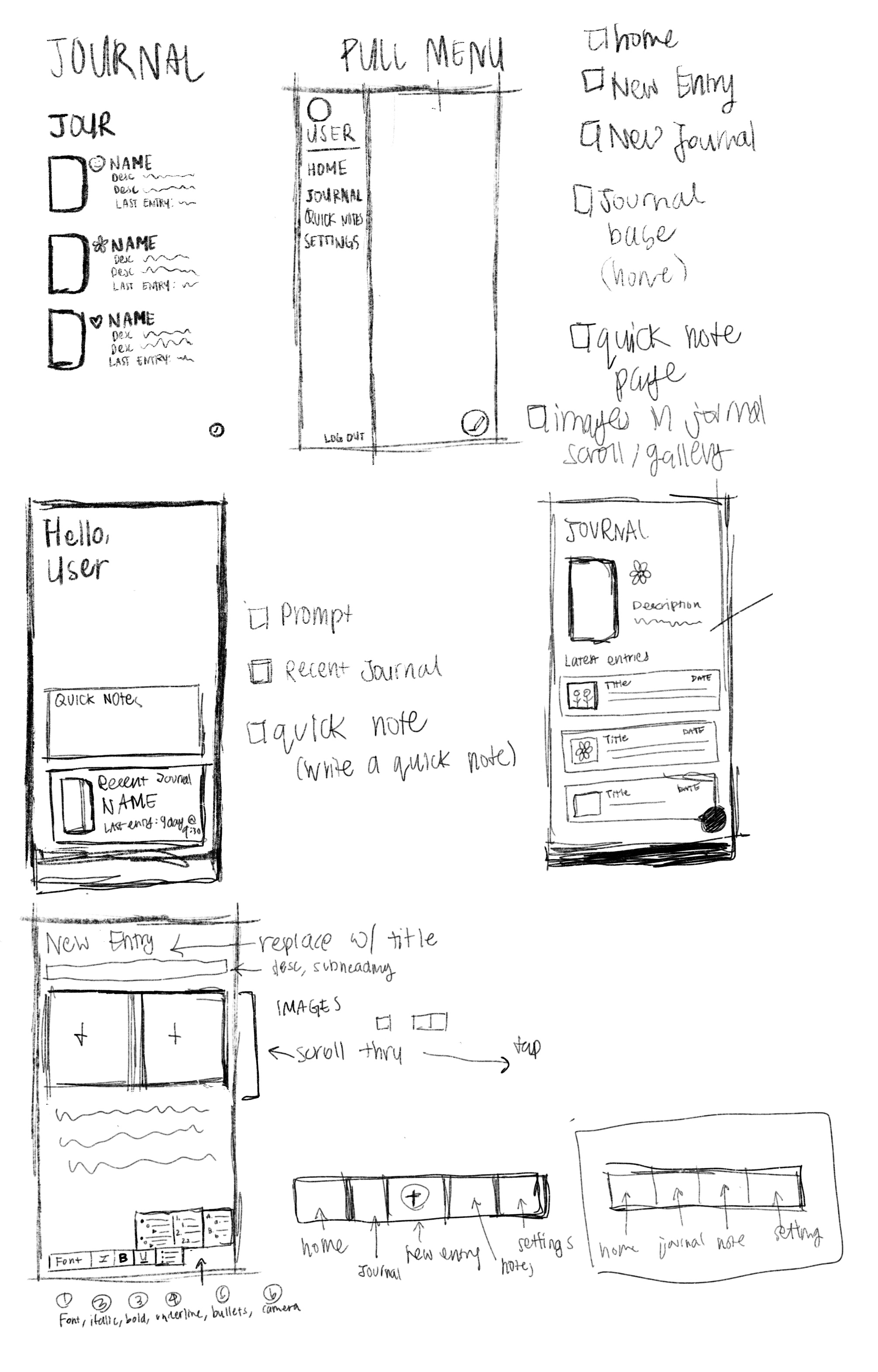
My wireframe was fully prototyped, which helped significantly moving forward. Being able to simulate the experience of actually using the app made it feel like real. I was able to experience what worked and what didn’t.
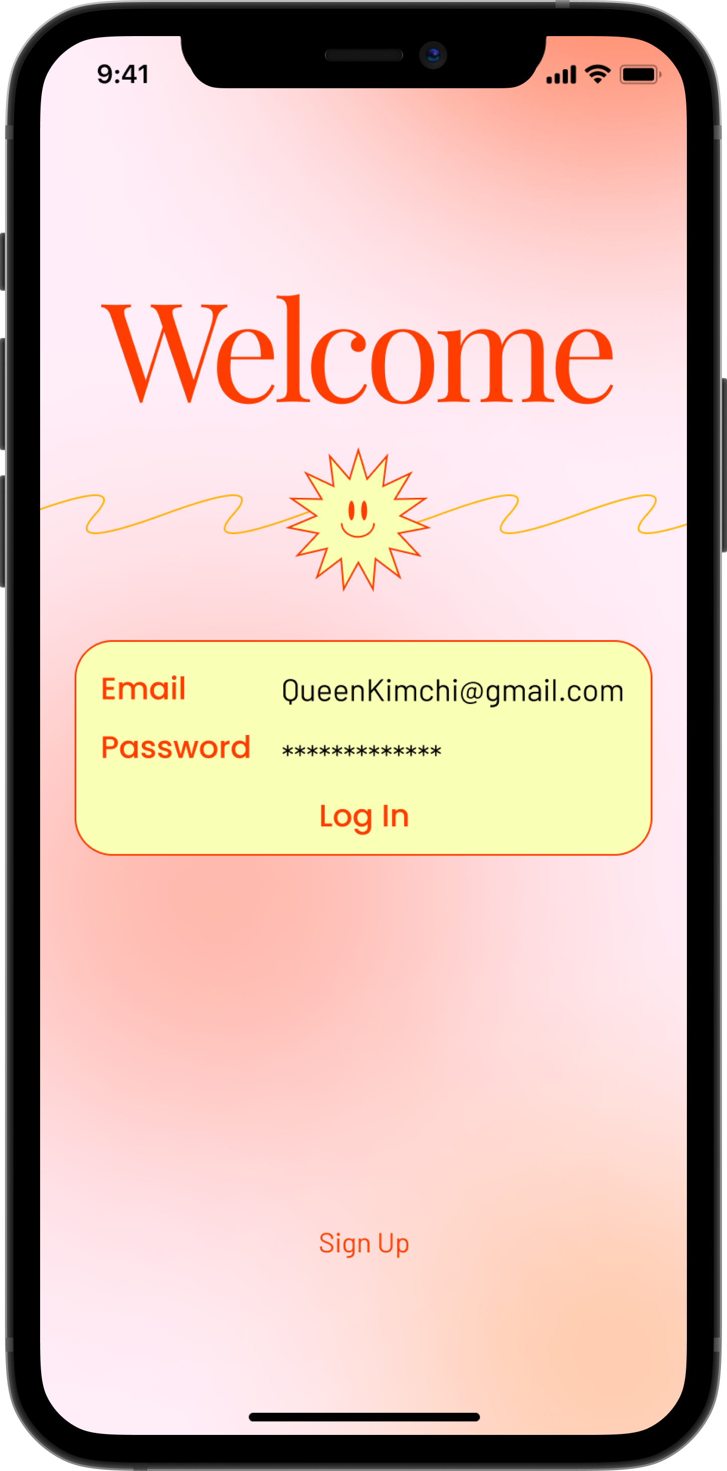
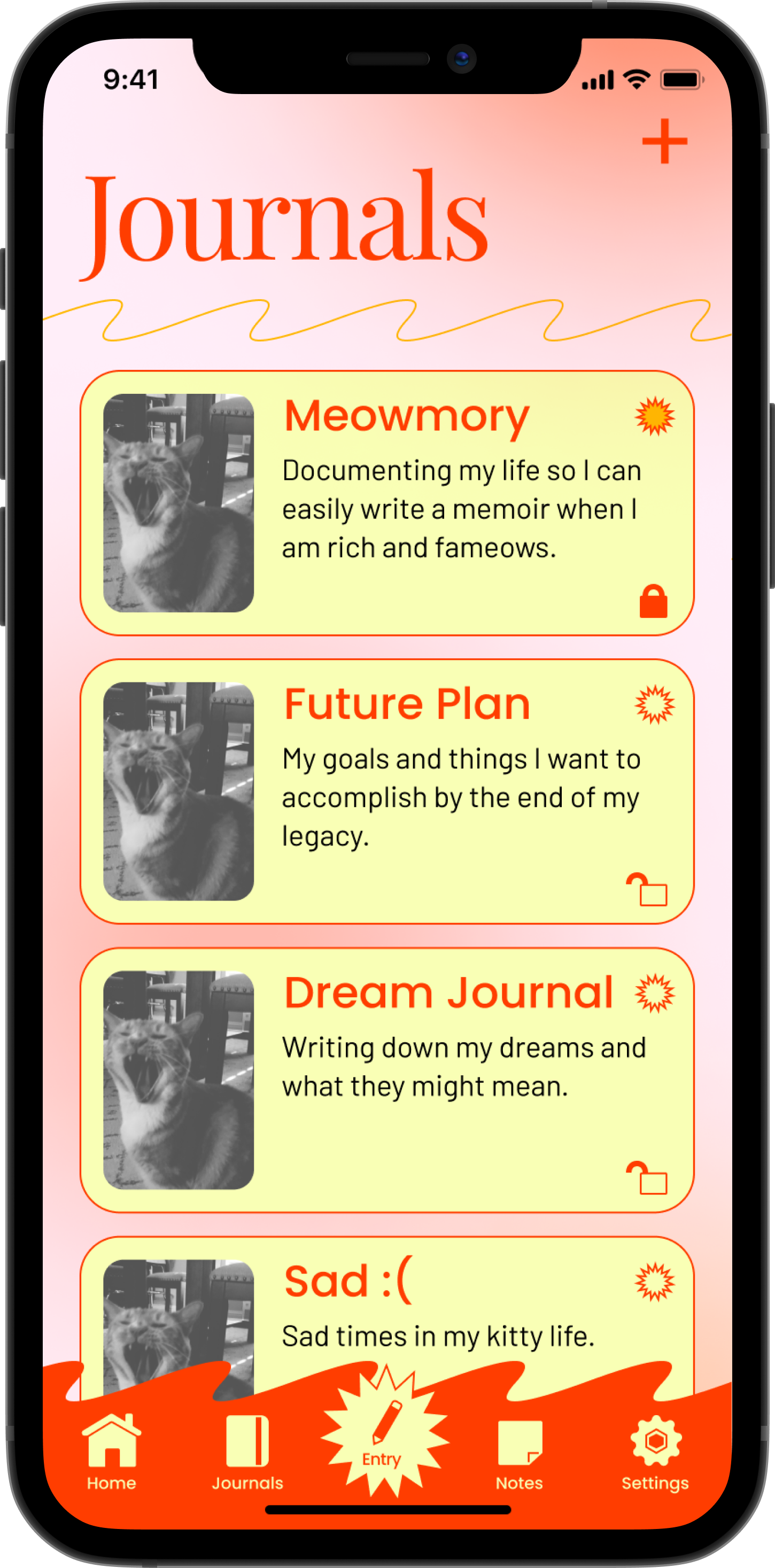
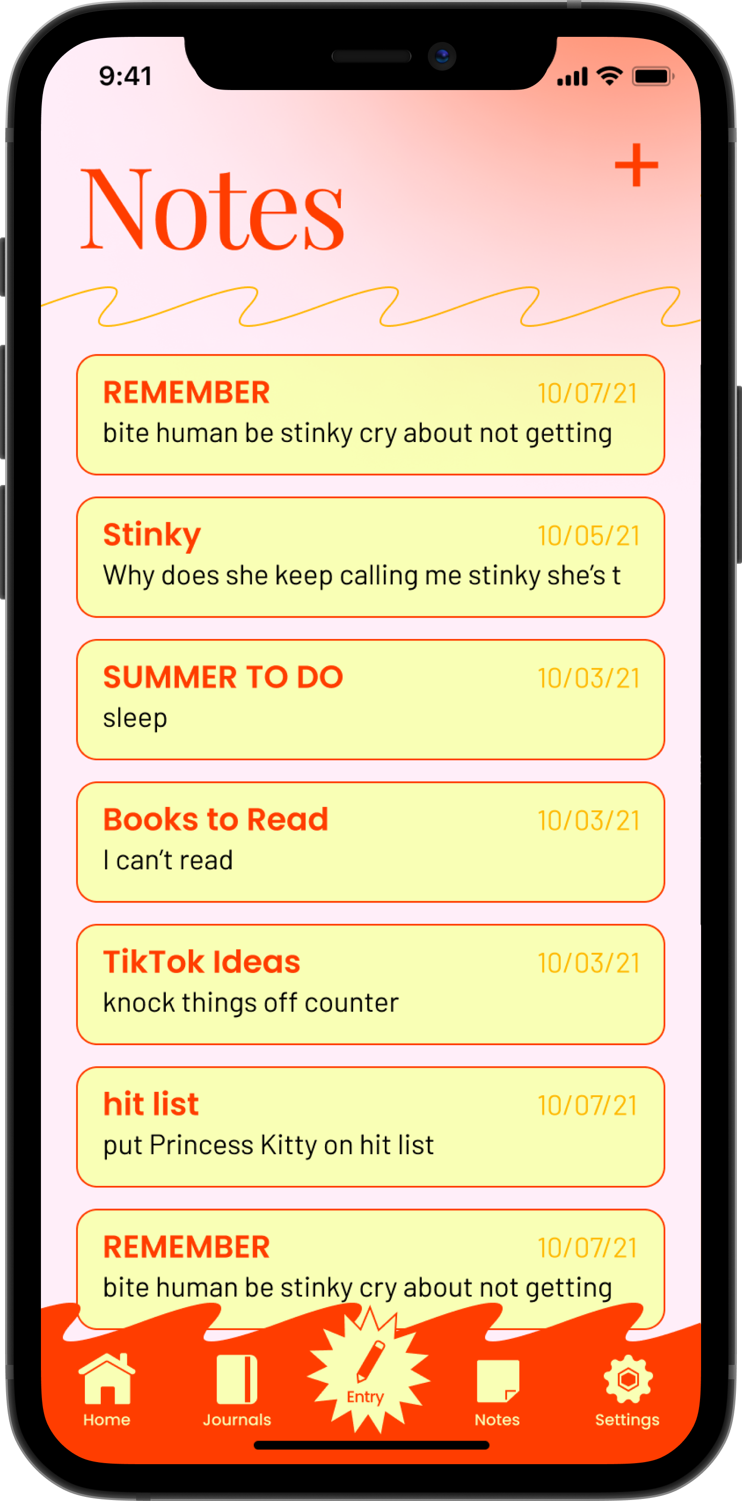
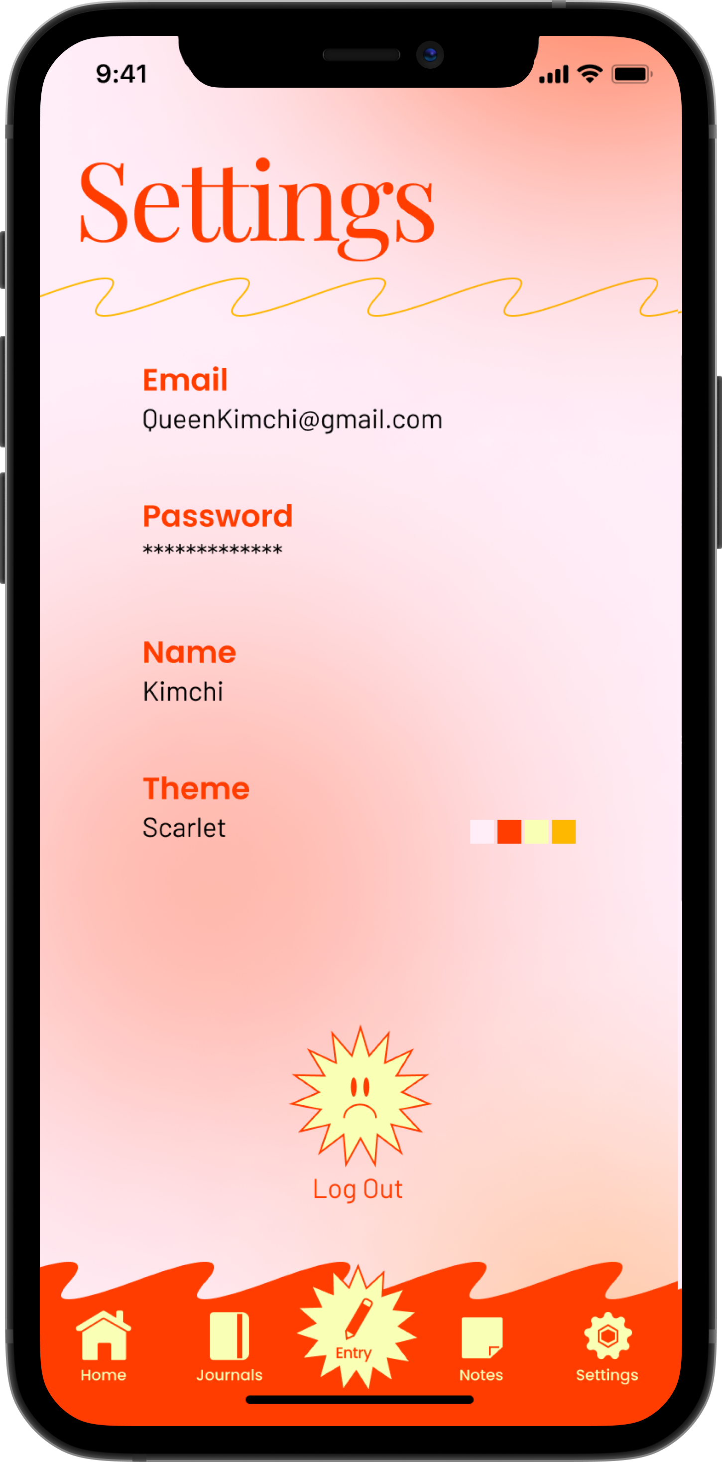
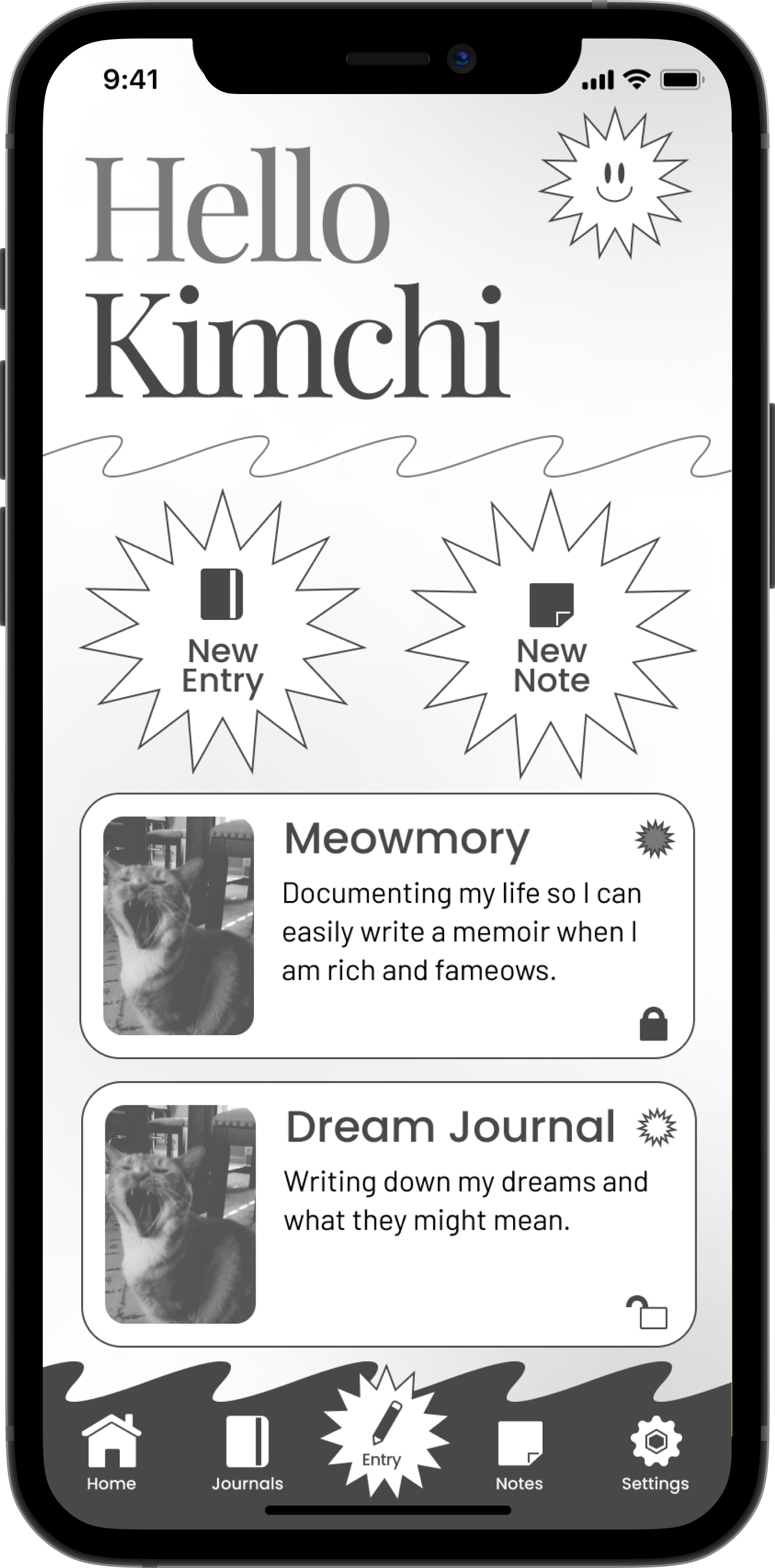
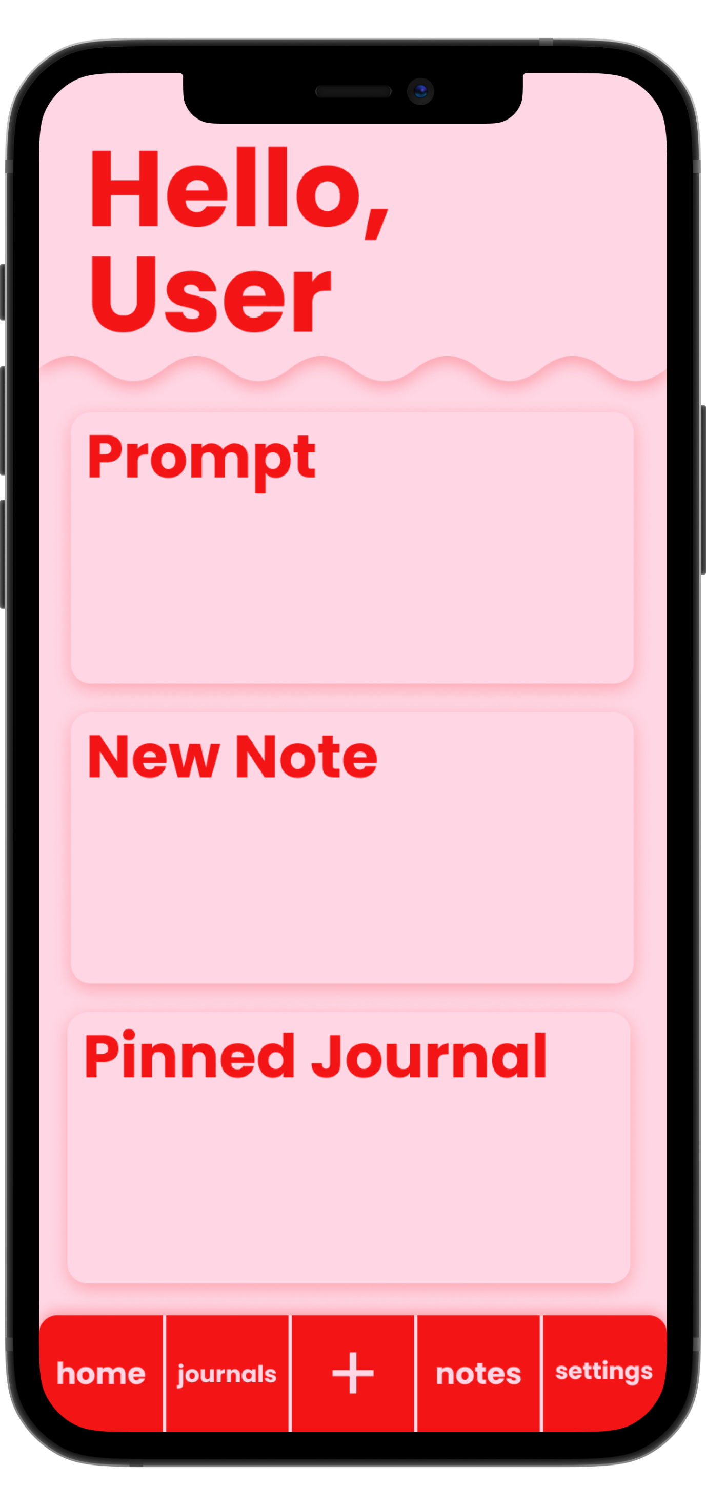
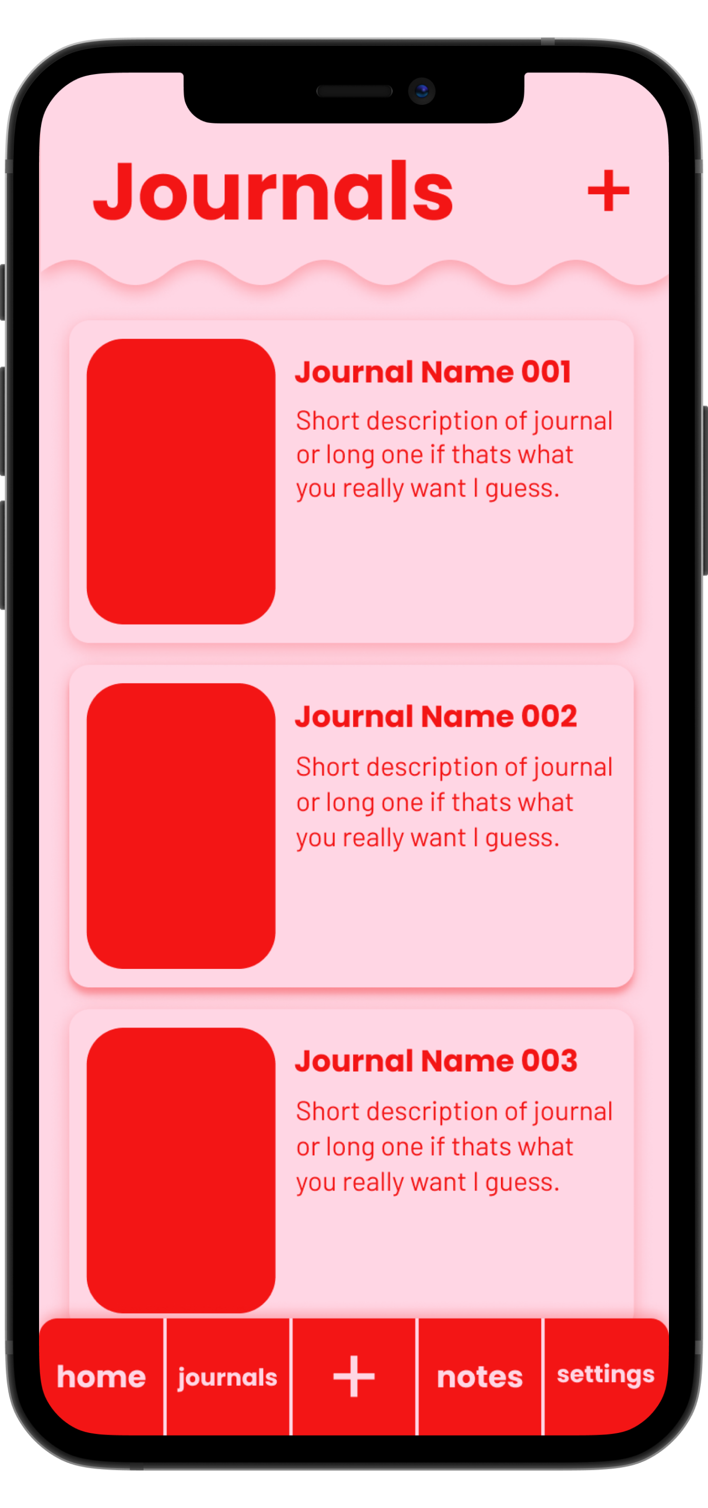
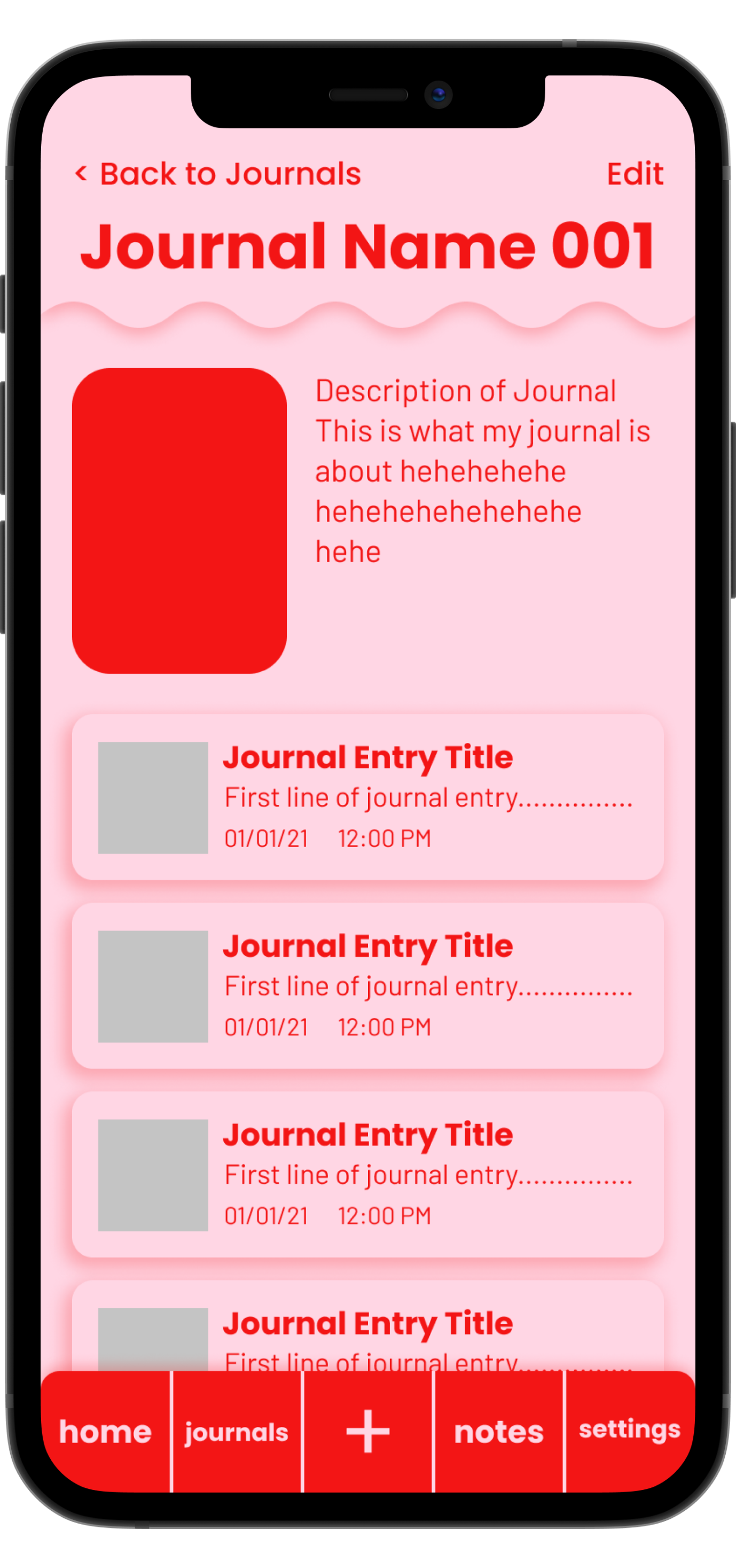
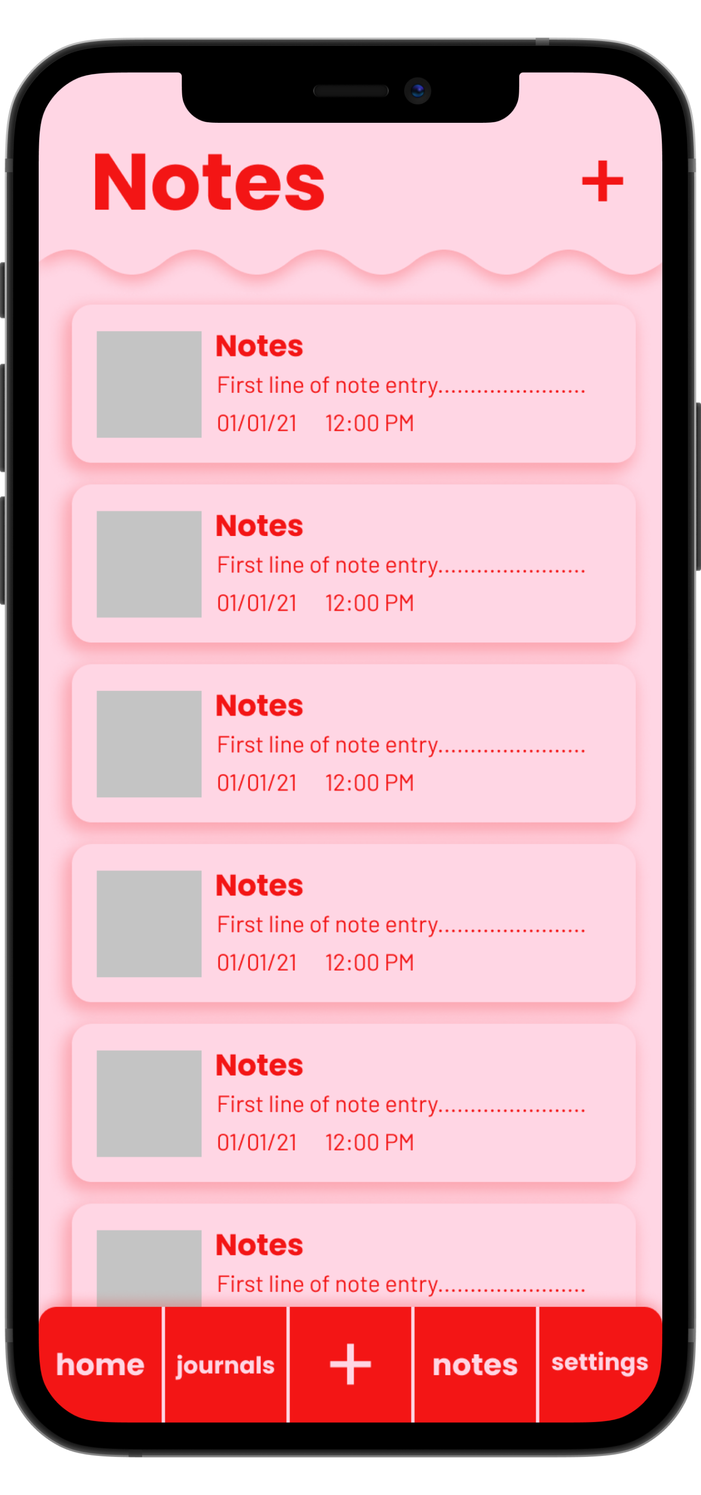
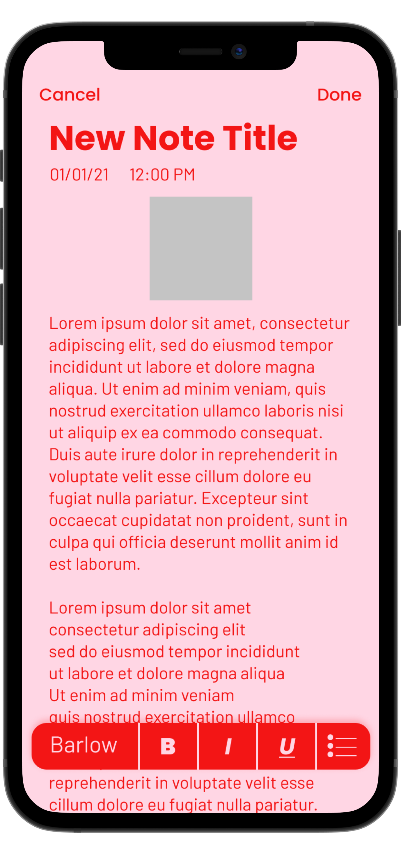
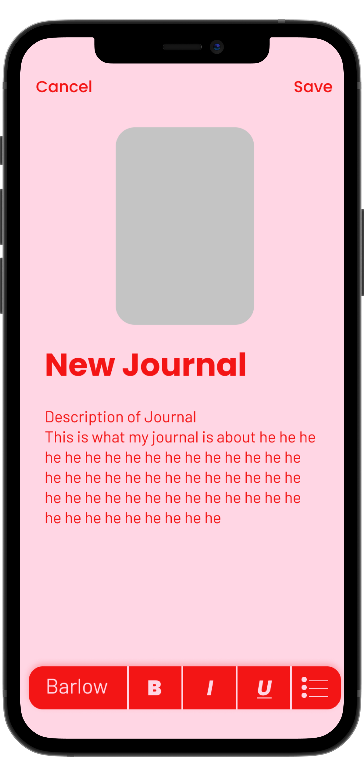
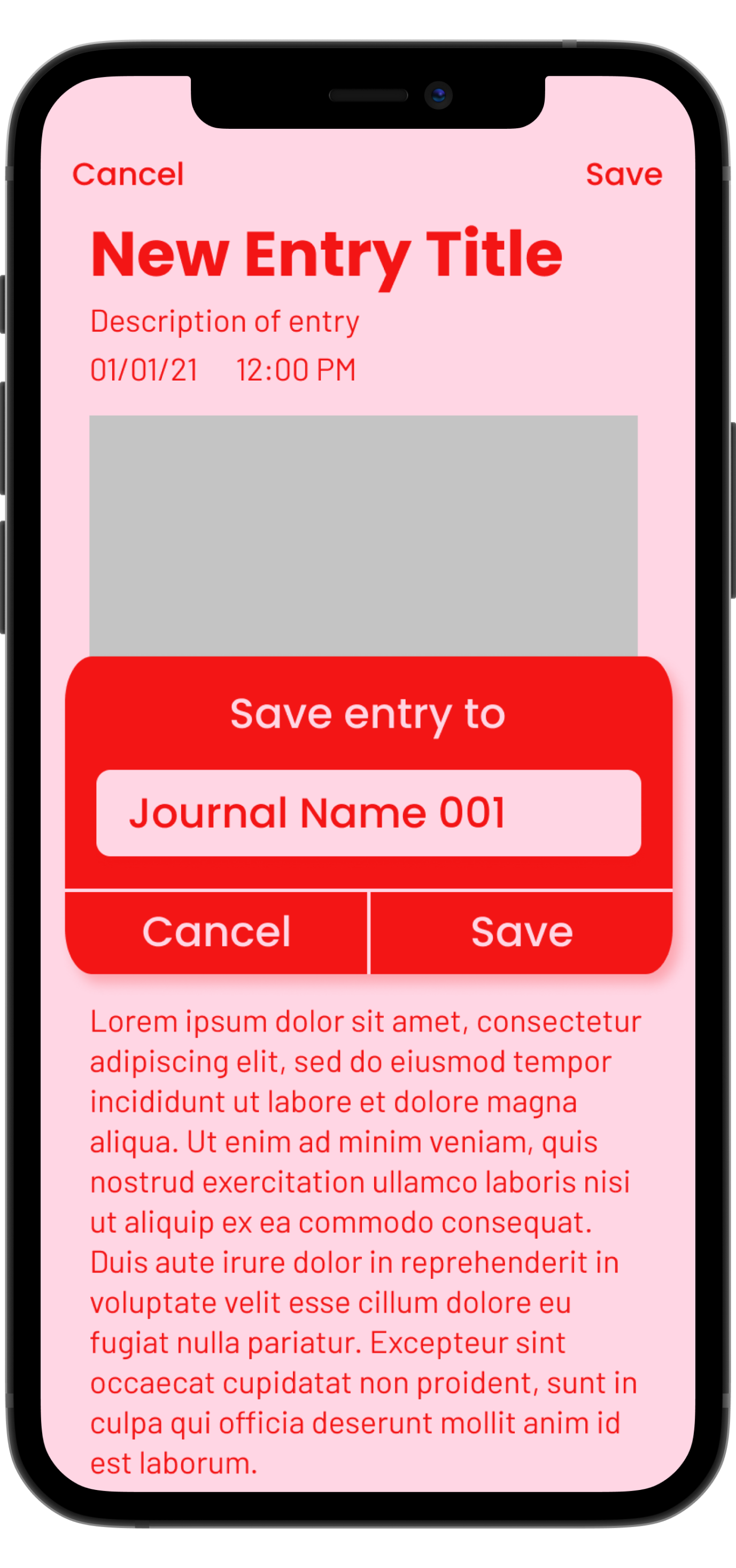
FINAL APP
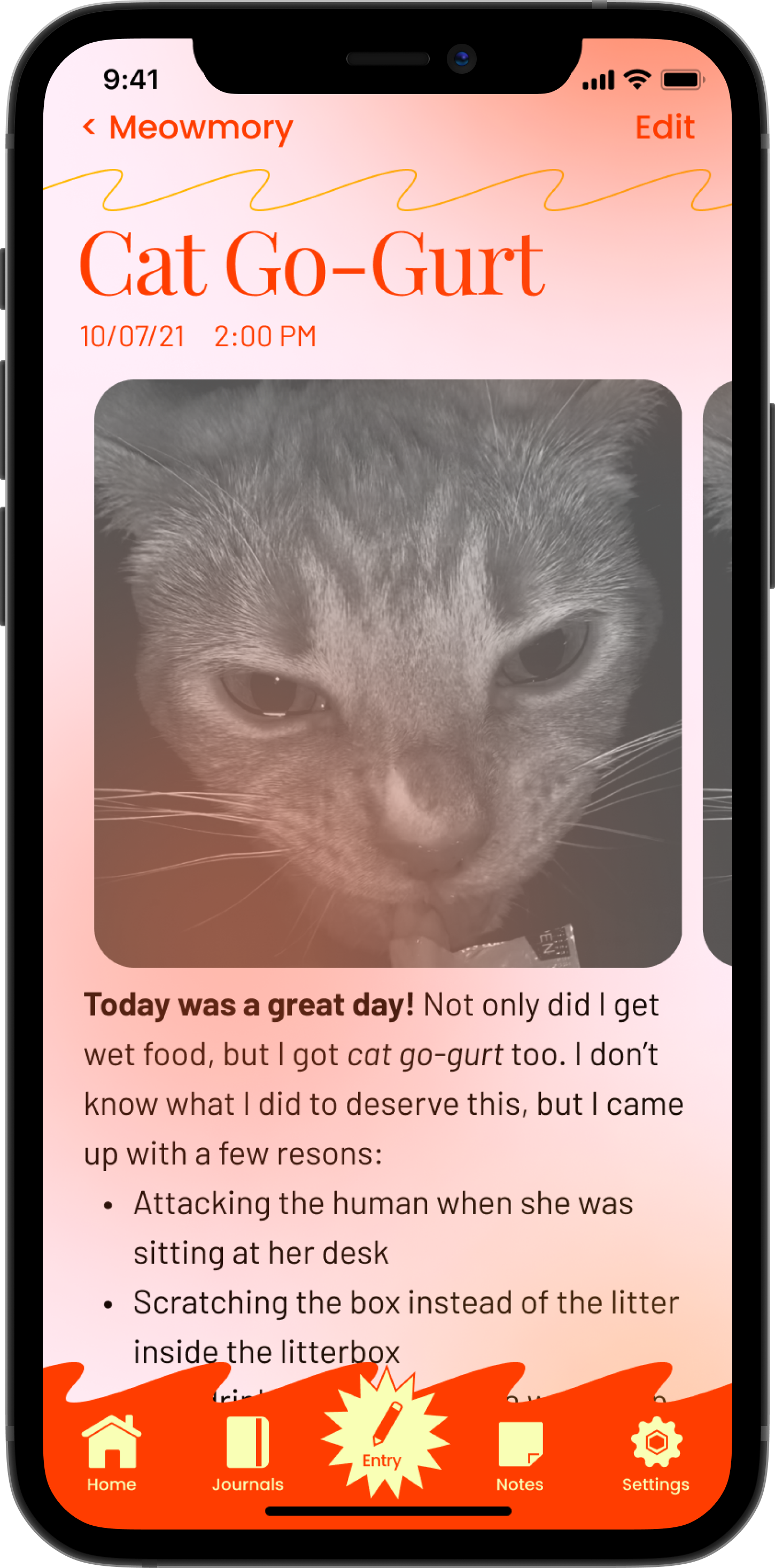
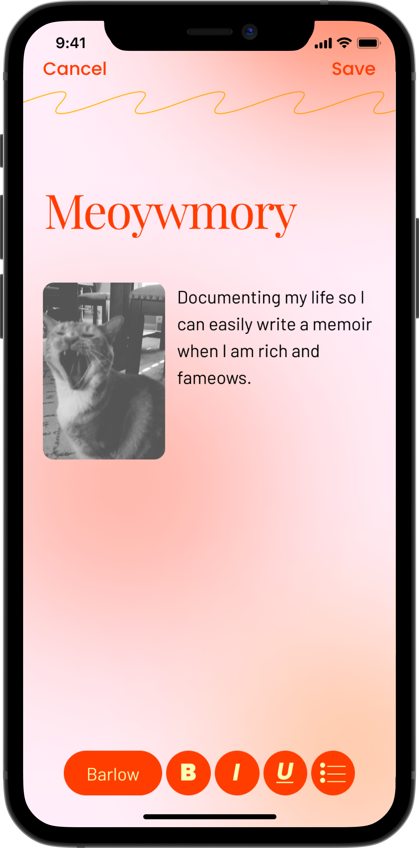
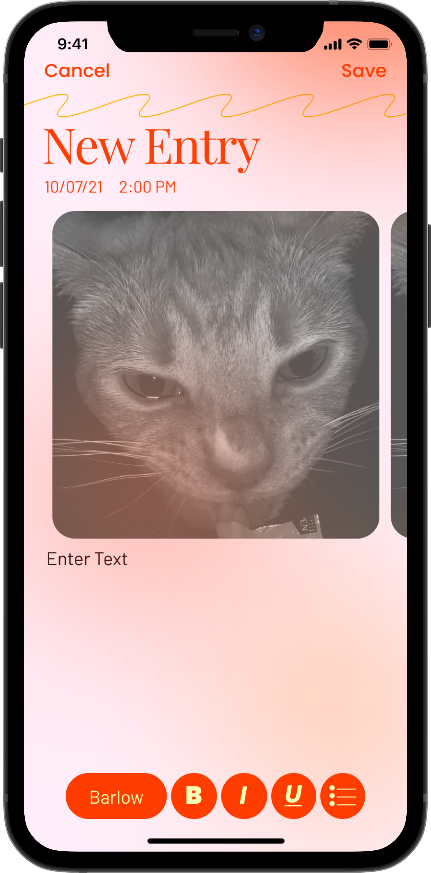
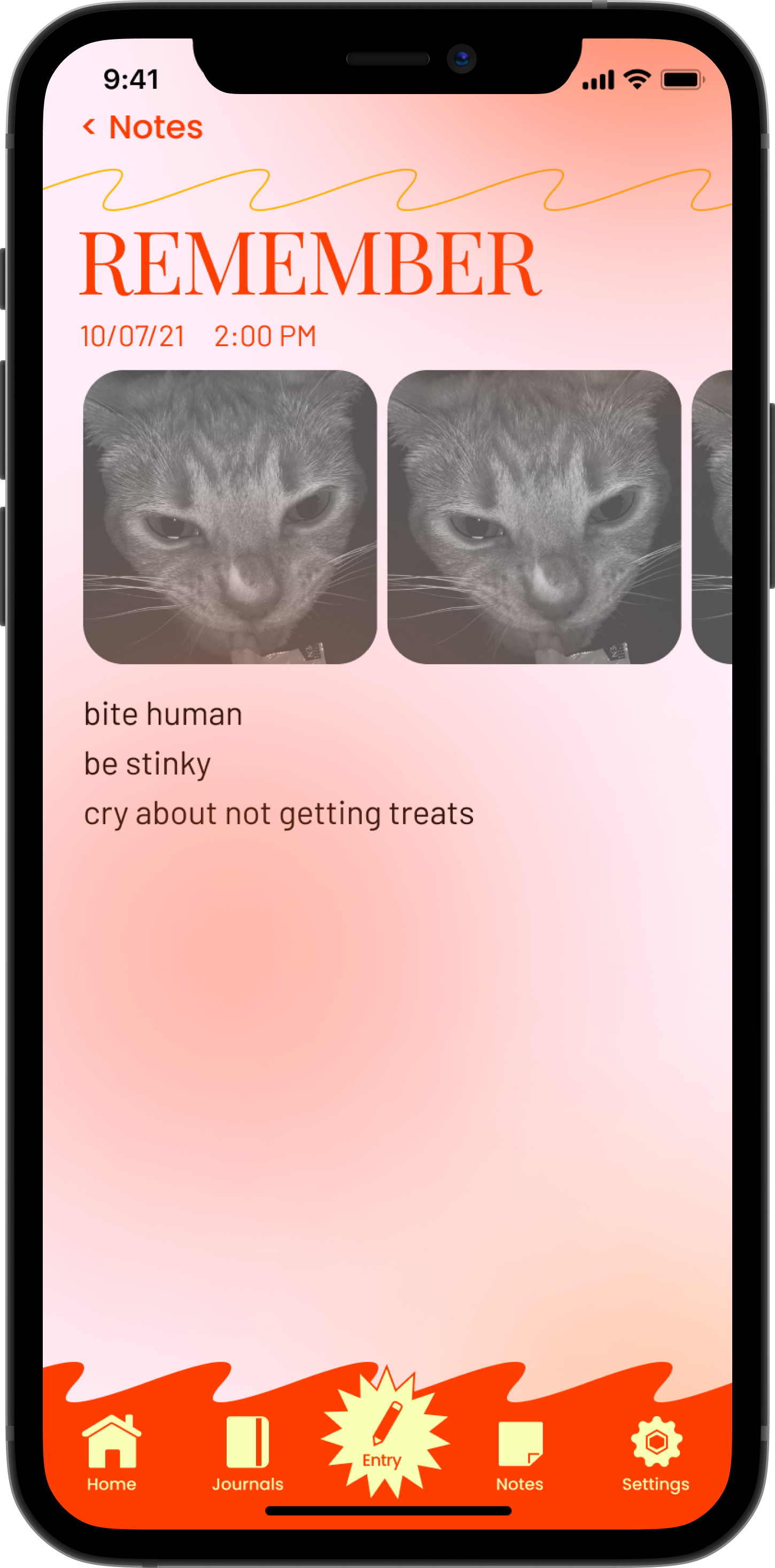
The content within the app are journal entries and notes through the perspective of my cat, Kimchi. I wanted Journally to be quirky and inject personality into a service that is ironically devoid of it.
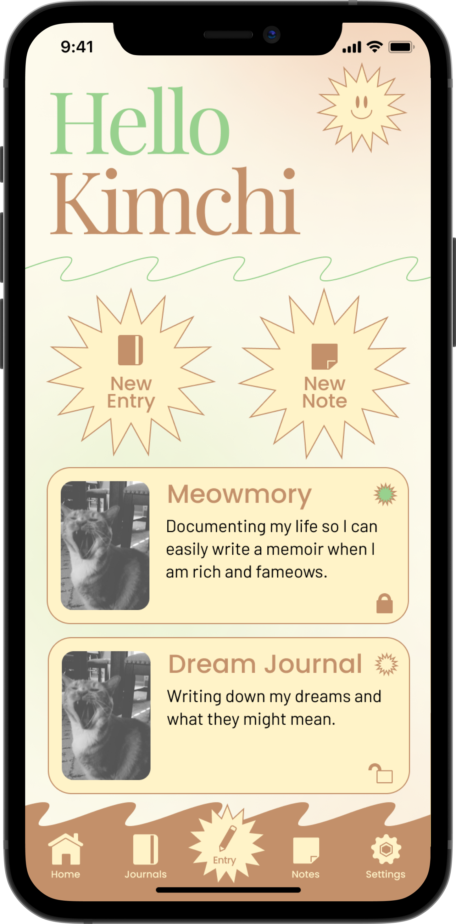
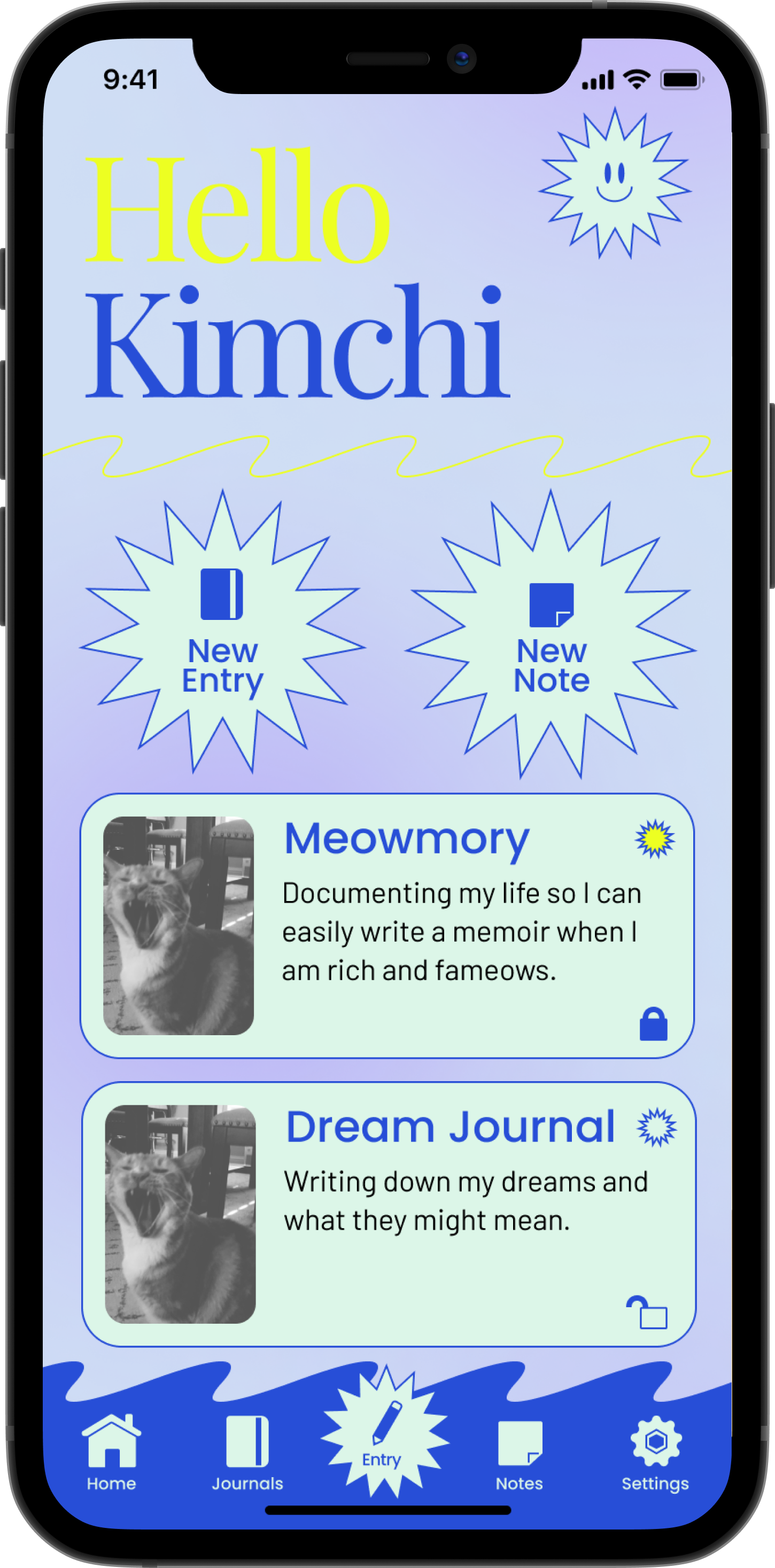
It was important to push the design beyond what an app “should look like”. I chose fun colors, but also allowed users to switch between different color schemes and fonts. The addition of pictures and separate journals for compartmentalizing further allows for that personalization.